Beginners guide to Exploratory Data Analysis (EDA)

Hi there, I'm Godbright let's start exploring data science and AI together, I will be sharing my learning journey through these articles. You can also get the data that I have used via this link
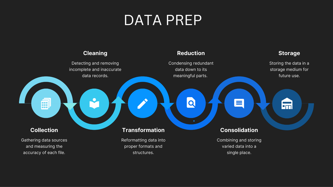
In the past few years doing EDA was a bit cumbersome task as the data scientist needed to go through a lot of steps to make that possible but in recent years a lot of tools have been put for data scientists to ease and fasten the process of EDA, Tools such as Data prep, Panda profiling, and Sweet viz has revolutionised the way we deal with data, particularly in EDA. In this short blog spot, we will try to have a walkthrough of data prep among the recent most used tool for EDA, in order to have an in-depth knowledge of how this tool can be utilized in your next data science EDA sessions.
Data importation
Before the analysis starts we will import and process the data we will be using throughout the article, We are going to use infant mortality rate and life expectancy data from Tanzania, And thus our source provides extra data which combines other countries, and thus this process will also include filtering out the data from Tanzania which we need.
we will start with importing the data and filtering it to obtain data from Tanzania. And thus we will use pandas to perform that activity.
import pandas as pd

#import the data sets
mortality_rate_dataframe = pd.read_csv("mortality_rates.csv")

#check the data contents
mortality_rate_dataframe.head()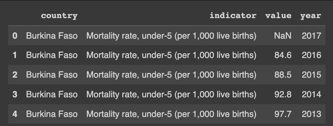
Simple Data filtering using (LOC)
In order to obtain data from Tanzania only we will use loc to filter the whole dataset and obtain the required data, And last we will assign it to our data set.
#Filtering the data to only get data from Tanzania
mortality_rate_dataframe = mortality_rate_dataframe.loc[mortality_rate_dataframe["country"]=="Tanzania"]

#Observing the data
mortality_rate_dataframe.head()
We will perform the same process for the life expectancy data, starting from importation and filtering of data to only get data from Tanzania.
#Reading data from the csv
life_exp_dataframe = pd.read_csv("life.csv")

#checking the data
life_exp_dataframe.head()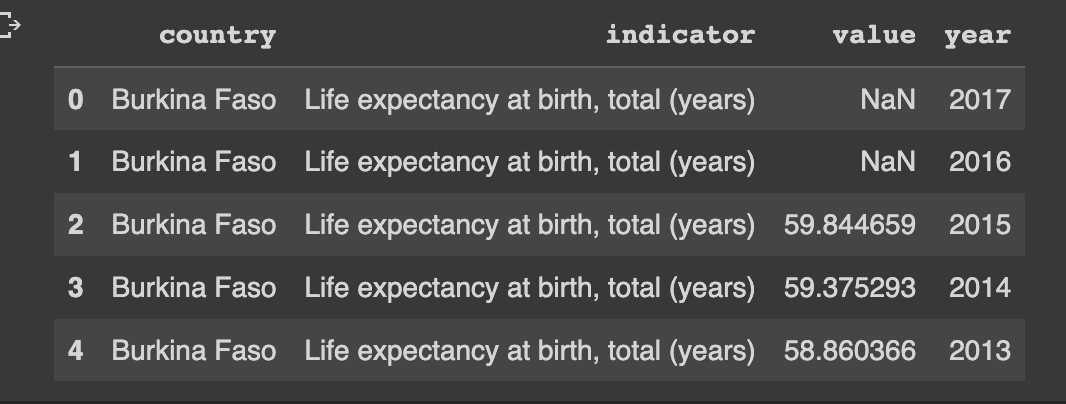
And thus we will also filter the life expectancy data to only get the required data
#Filtering the data
life_exp_dataframe = life_exp_dataframe.loc[life_exp_dataframe["country"]=="Tanzania"]

#checking the data
life_exp_dataframe.head()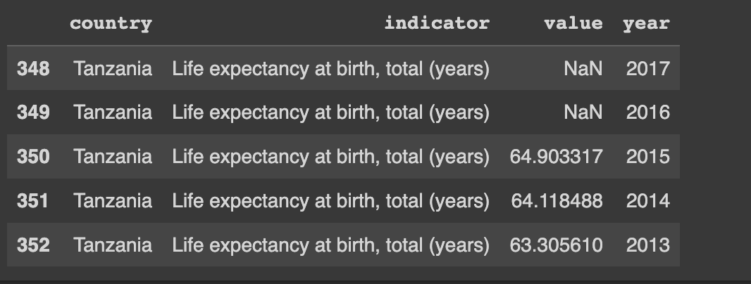
Now that we have all the data filtered we need to combine the two data frames in order to get a single data frame that we will be working with, this process will also involve dropping duplicated columns and renaming columns that have the same names as you might have noticed in our datasets, ie value column
Renaming and dropping unwanted columns
#changes the value column into exp_val
life_exp_dataframe["exp_val"] = life_exp_dataframe["value"]

#Drop the value column which we wont be needing
life_exp_dataframe = life_exp_dataframe.drop(columns=["value","country","year])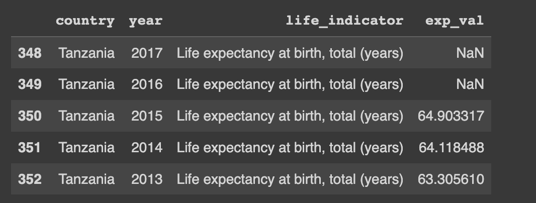
You are going to try the same activity for the mortality rate dataset and leave a comment if it works.
After finishing the process of fine-tuning the data we are going to concatenate or combine the two datasets in order to provide a single dataset that we will use. In this particular step, we will use a function called concat() provided by pandas, see the following example. It is very important to specify the axis so that pandas can deduce the direction in which I will apply the operation. When the axis is specified as 0 it means the task will be applied row-wise meaning it will be applied vertically row by row and the data will be stacked vertically. On the other hand, if the axis is specified as 1 the operation will be applied column wise meaning it will be applied horizontally column by column and the data will be assigned side by side.
latest_dataset = pd.concat([life_exp_dataframe,mortality_rate_dataframe], axis=1)
latest_dataset.head()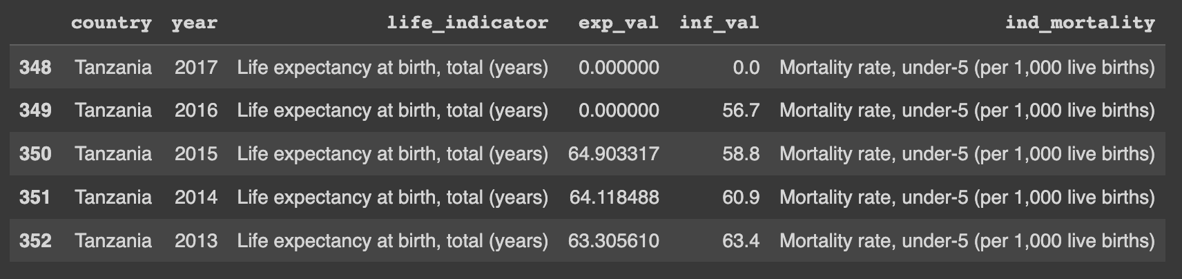
Data Prep Installation
The installation process is rather straightforward, you start by typing this on your terminal or jupyter notebook to install the data prep.
pip install dataprepThe above command will install everything you need to get started with data prep.
To get started with the EDA process you will need to import the appropriate class for EDA and start exploring different methods that come with it.
Plotting using Data prep
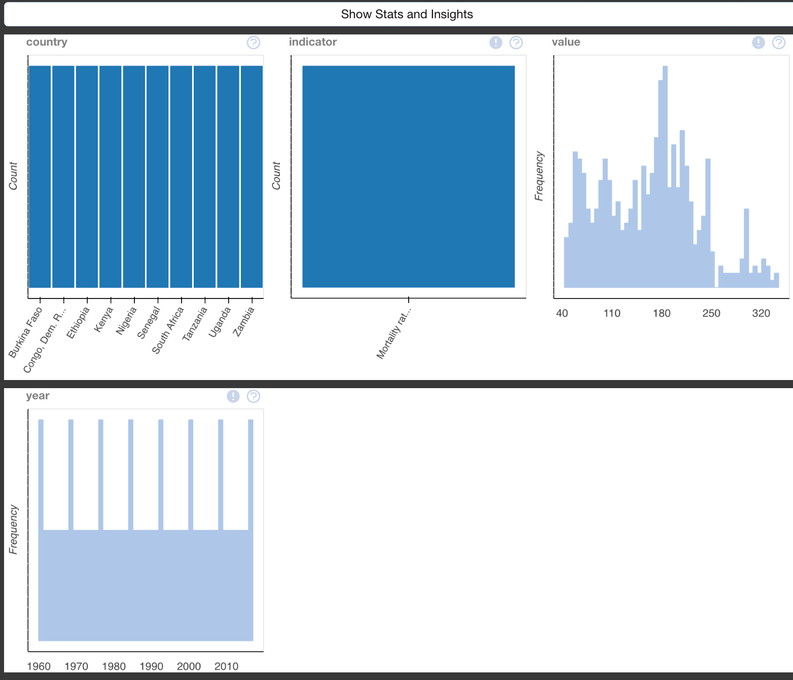
The following example will show you the command which you can use to plot different graphs to help with the visualizations of different features in your dataset.
It seems to be a bit customary to observe your data most times before you perform any operation with it and thus in this example, we observe the infant mortality rate data from Tanzania, before we start plotting its individual visualization, try to do the same for the life expectancy data that we imported earlier to try and see different aspects of the dataset.
from dataprep.eda import plot
import pandas as pd

#check the data contents
mortality_rate_dataframe.head()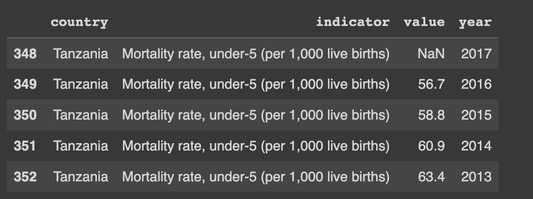
if you want to explore a specific variable in your data frame you can supply the variable as a second argument in the plot function, in which you will be given different distributions together with other statistical calculations related to that value
To further generate plots that show the relationships between two specific variables from your data frame you can supply the variable as the third variable in the plot function and you will be given different visualizations tailored specifically for the two variables.
#plot the data set values
plot(mortality_rate_dataframe)

#plots for one specific variable
plot(mortality_rate_dataframe , x)

#plot for two different variables to be visualised together
plot(mortality_rate_dataframe, x, y)
Plotting correlation between different variables in your data frame
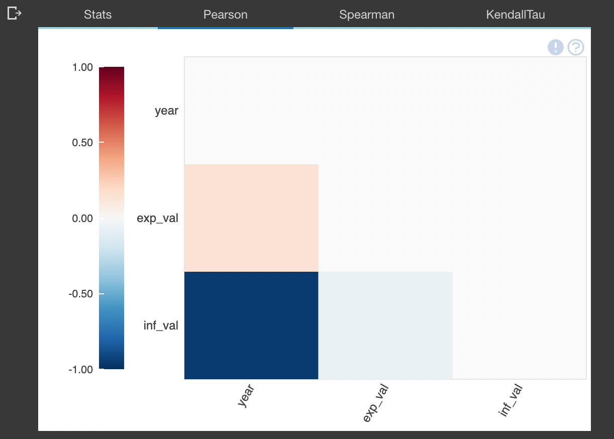
To plot correlation we will use the dataset we obtained from combining the life expectancy and infant mortality rate data in order to try and deduce any kind of correlation between the values.
The function plot_correlation() is used to explore the correlation between different columns in your data frame together with providing different correlation metrics which could help you in one way or another arrive at your conclusions about the relationship that the one data column has with the other.
On the other hand, you can explore what other columns are mostly correlated to your column of interest by using the function plot_correlation(example_dataframe, x ), here "X" being your column of interest. This can help you to efficiently identify other columns which are tightly related to the X column.
You can also plot different correlation plots between two columns of your interest, this would also help to plot the regression line which will provide the the kind of relationship shared between those columns and two what extent.
from dataprep.eda import plot_correlation


#plot the correlation between different columns in your datasates
plot_correlation(latest_dataset)

#plot the correlation highlighting a specific column

plot_correlation(latest_dataset, exp_val)

#plot correlation graphs focusing on two specific columns
plot_correlation(latest_dataset, exp_val , inf_val)
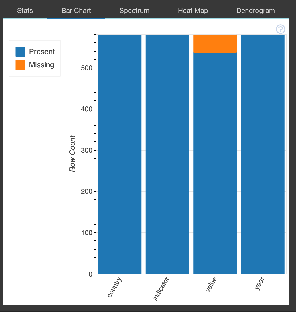
Analyzing missing values in your datasets
To analyze very important aspects of your data such as how much data is missing from a certain column you can use the plot_missing() function which will pull an extensive overview of the amount of data missing. This will help in the analysis of the impact posed to the data caused by the missing data.
This function can also be used to assess the impact of data missing in one column or two columns on the whole data set by providing different visualizations which depict the impact of the missing data. To do so you would supply as a second argument or the third argument the column variable that you want to assess.
from dataprep.eda import plot_missing

#check the data contents
mortality_rate_dataframe.head()

#plot the missing data in the whole data frame
plot_missing(mortality_rate_dataframe)

#plot the visualisation of the impact of  column x missing data on the whole dataframe
plot_missing(mortality_rate_dataframe, x)

#plot the impact of missing data from column x and column y
plot_missing(mortality_rate_dataframe,x , y)
Create a profile report
The function create_report() creates a stocked HTML report in all the previously highlighted data prep components.eda package. The HTML document will contain the following information.
- Overview: which will detect the types of columns in a data frame
- Variables: variable type, unique values, distinct count, missing values
- Quantile statistics like minimum value, Q1, median, Q3, maximum, range, interquartile range
- Descriptive statistics like mean, mode, standard deviation, sum, median absolute deviation, coefficient of variation, kurtosis, skewness
- Text analysis for length, sample, and letter
- Correlations: highlighting of highly correlated variables, Spearman, Pearson, and Kendall matrices
- Missing Values: bar chart, heatmap, and spectrum of missing values
#import libraries
from dataprep.eda import create_report

#create report
report = create_report(latest_dataset, title='INFANT MORTALITY RATE REPORT')
reportyou can download and explore an example report from here.
The DataPrep data cleaning and validation package
On the other hand, Dataprep provides a package that can be used in quick data cleaning and validation, it can be used in many different instances. For example, it can be used to provide clean country names from badly formatted or written column names.
from dataprep.clean import clean_country
import pandas as pd

#import data frame
df = pd.read_csv("example_dataframe")

#function to clean the country names in the data frame
clean_country(df, "country")
You can visit the documentation to explore different cleaning functions that you can utilize in your next project.