Introduction to visualisation with Seaborn

Lets again kickstart the conversation around visualization with a powerful library for visualization called Seaborn. This library is built on top of matplotlib which gives it the power to create more visually appealing statistical graphics. Now to simplify this introductory article we are going to associate how you can use seaborn depending on the kind of data you are trying to visualize, To start with we do have two kinds of data mainly when we are dealing with data science which are categorical data and relational data, In this sense these two kinds of data requires different kinds of visualizations and techniques to better understand certain criteria or behavior portrayed by the data. Seaborn has a very good classification in terms of what functions you would use when dealing with either categorical or numerical data. We are going to start with the seaborn installation process and later show how you would approach visualizing both kinds of data.
Seaborn Installation process
There are two ways that seaborn can be installed on your machine, depending on the setup you are using pip or conda can be utilised. Normally we can install the library using pip as below. This will install Seaborn together with all the dependency that is required by it to work.
pip install seabornOn the other hand, conda can also be used as follows to install Seaborn and all the other necessary dependencies required by it to work.
conda install seaborn
To get started with Seaborn you would need to import the dependency as shown below and load a dataset from one of the example datasets offered by Seaborn and later plot the statistical graph you need.
#importing seaborn
import seaborn as sns

#loading the datasets
df = sns.load_datasets("penguins")

#ploting a parplot
sns.pairplot(df, hue="species")
Above you can see how visually appealing and informative seaborn visualizations can be.
Categorical Data Visualisation
Now we will try to jump back to the conversation about plotting with data kind in mind and try to show it with examples.
To start with categorical data, seaborn provides a specific function that can be used to pull out several statistical graphics which can be used for categorical data. We are going to initially fix our focus on categorical estimations plots which are point plot, barplot, and count plots. Now the function used here is "catplot". which to access any of the above-mentioned plots you would use the kind parameter to the catplot function and supply the name of the plot , you would also need to supply the data frame you are working with, the values you want to plot on the x-axis and the values on the y-axis. These are among the very basic setups to do to get a visualization of your data.
Step 01: Import all the required libraries and load the data sets that you are going to use, in this article we are going to use the automobile dataset.
import pandas as pd
import matplotlib.pyplot as plt
import seaborn as sns

#loading the data using pandas
df = pd.read_csv("automobile.csv")

#check the data
df.head()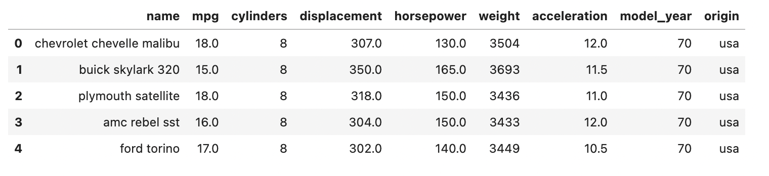
step02: start utilizing seaborn by developing different plots using the sns abbreviation to access different methods,
sns.catplot(data = df, kind = "count" , x="origin")
count_plot.set_xticklabels(rotation = 90, )
plt.show()
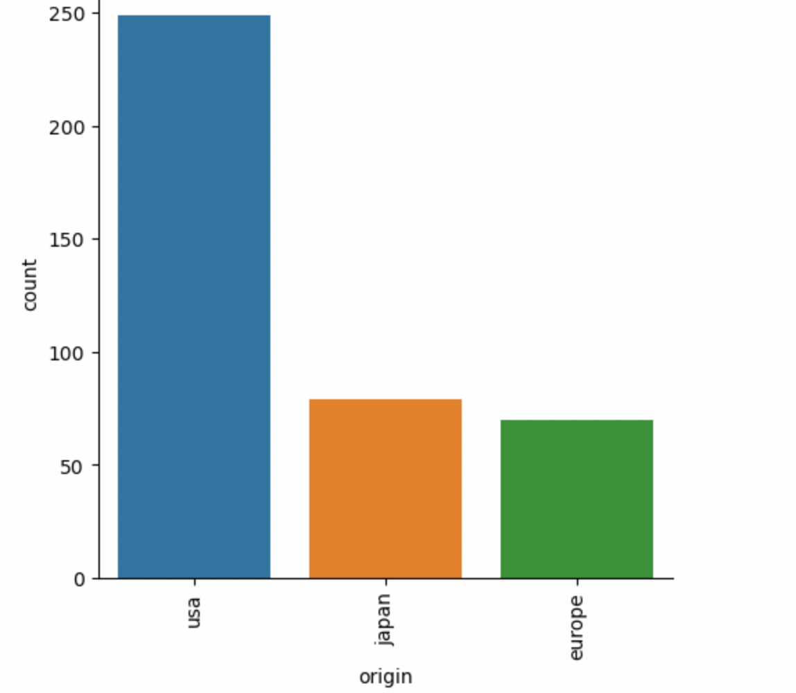
As you can see the codes gave us a look into the total sum of cars from different areas of origin that are in our dataset.
To visualize a mixture of quantitative and categorical variables a bar plot can be used, in our instance we will compare the model year and the acceleration of the particular car.
myplot = sns.catplot(data= df, kind="bar",y="acceleration", x="model_year" )
myplot.set_xticklabels(rotation = 90)
plt.show()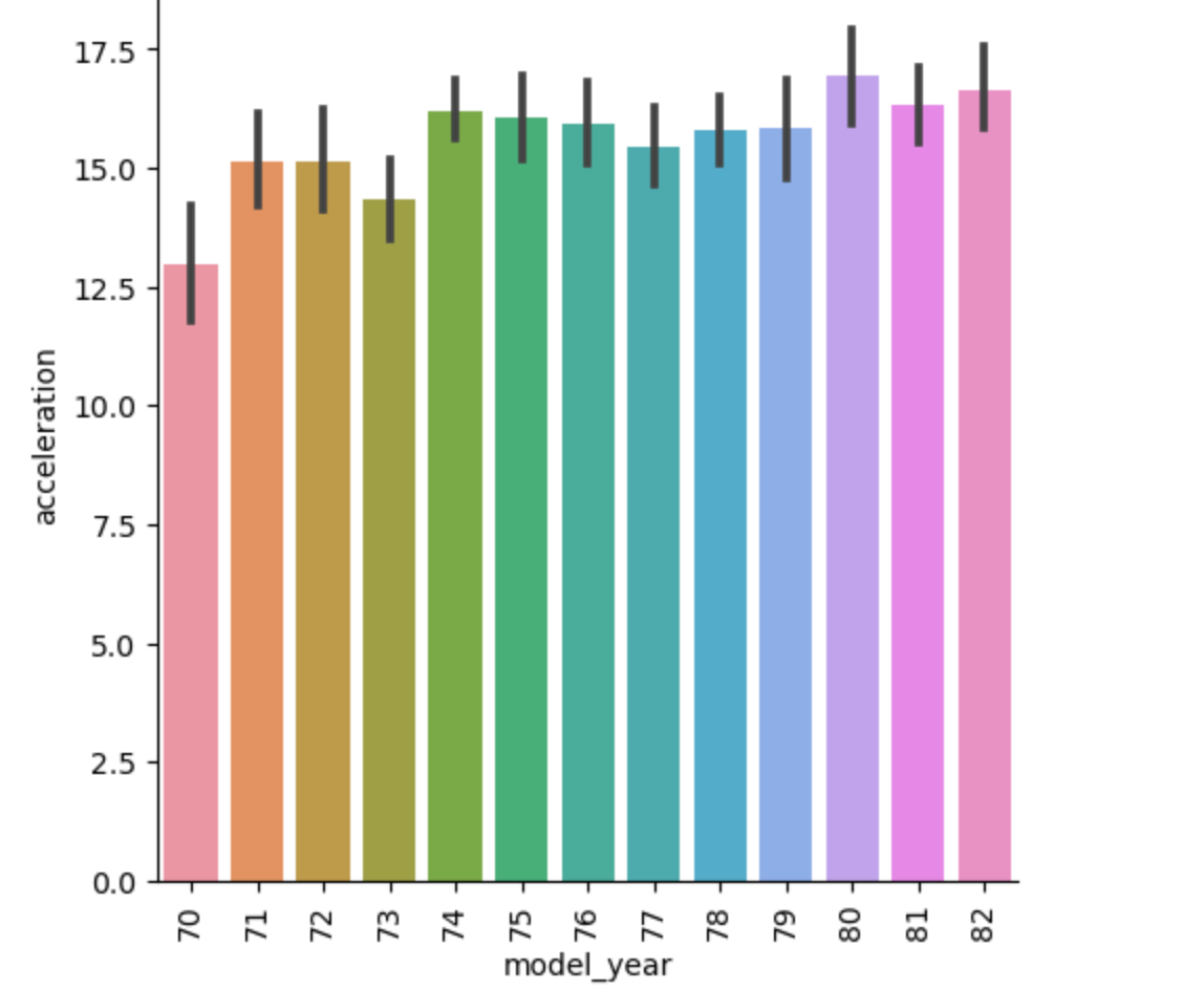
From the barplot, we can deduce that model the cars from 1980 have the highest acceleration compared to the others,
Finally, you can try other types of plots by choosing and changing the kind argument in the function to the type of plot you would want to have.
Relational Data visualisation
When it comes to relational data seaborn covers us with scatter plots and line plots which depending on what you are trying to assess and the data set that you have, can be used to assess relationships.
To start with we will try to use our automobile datasets to try to check the relationship between the weight of a vehicle and the acceleration of the car whilst using the hue parameter to highlight the car's origin.
sns.relplot(
data= df,
y="acceleration",
x="weight",
hue = "origin"
)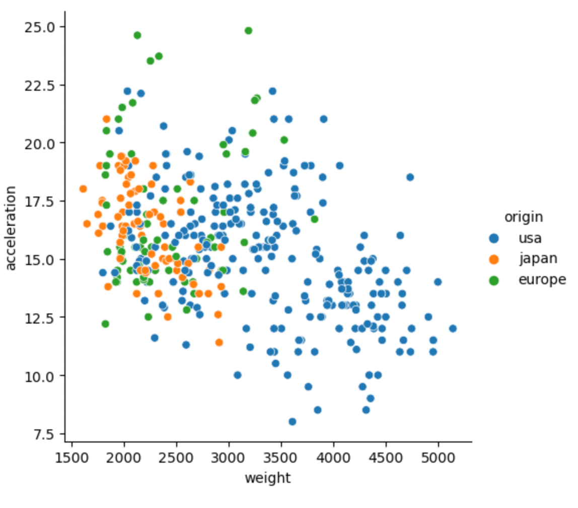
As you can observe from the datasets, the cars from the USA are mostly heavy-weight on the other hand the visualization portrays a negative correlation between the features as in when weight increases acceleration of the car will decrease and vice versa. On the other hand, we can introduce another feature using the size parameter in trying to associate further the relationship between the acceleration and weight of the automobile by also comparing the number of cylinders that the automobile has, this can be done as follows.
sns.relplot(
data= df,
y="acceleration",
x="weight",
size = "cylinders"
)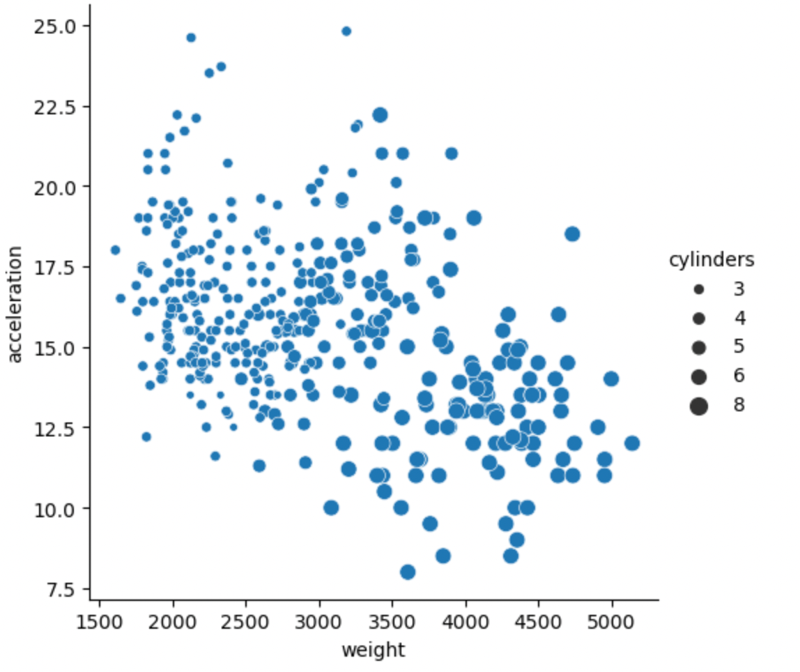
As you can observe from the visualization heavy weight can also be associated with more cylinders.
Finally, we are going to visualize our data using a line plot, This plot is mostly used when we are trying to observe the progression of a certain feature, in this example, we are going to check how over the years the automobile's acceleration has been affected.
sns.relplot(
    kind="line",
data= df,
x="model_year",
y="acceleration",
)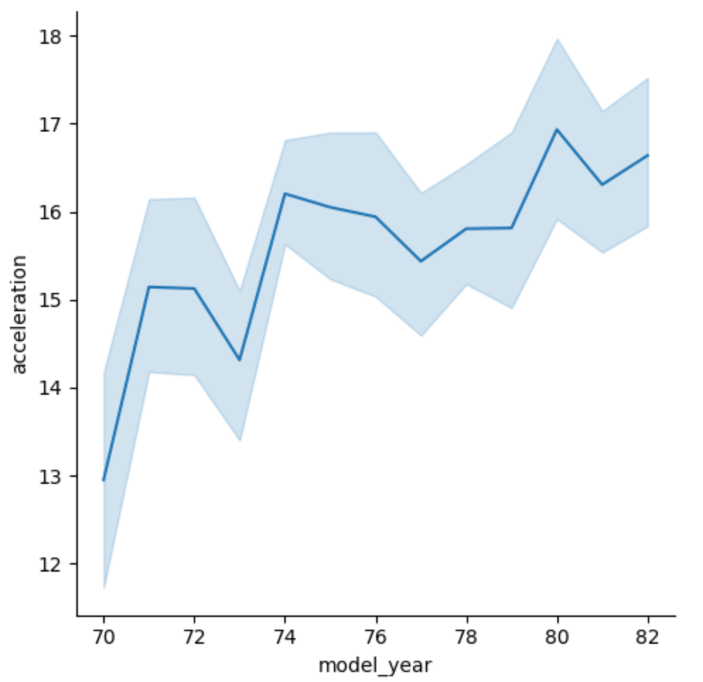
As you can observe from the line plot visualization the acceleration of automobiles has generally increased throughout the years.
In conclusion, The seaborn Library can be used to create a lot more insightful visualization which can help you understand your datasets well, It is high time for you to now explore all the other aspects of the documentation to fully embrace it.